Film poster research and pre-production
1) List the key conventions of a film poster.
Key images, Cast, Reviews, Mise-En-Scene, Title, Main Character names, Star Reviews, Production company, background image, Release date, tag-line, cast and crew.
2) What makes a film poster instantly recognisable?
2) What makes a film poster instantly recognisable?
The key image/background image, people will recognise the poster visually first before focusing in and seeing the title, therefore the image has to be catchy and very unique, the title also needs to be catchy to engage the audience in further.
3) What are regarded as some of the best film posters of all time? Why?
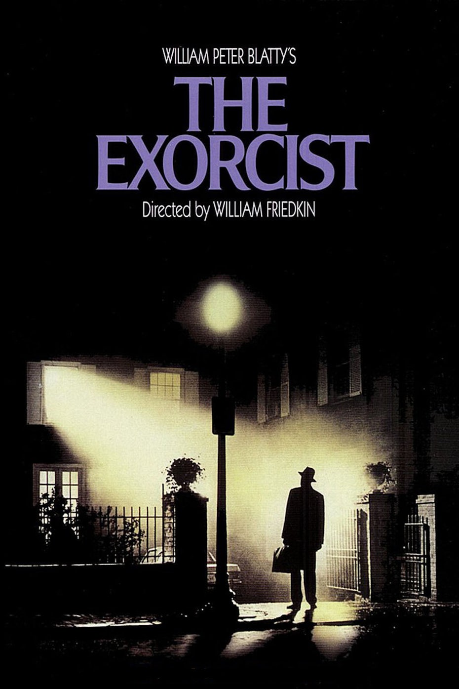
The Exorcist is an old-time classic that took a very simplistic approach towards designing their poster, this could be due to the lack of technology back in the 70's when the film was released or purely due to the fact that they wished to engage with the audience with a simple poster. The poster consists of only a man standing outside the house with a bright light coming from a widow. The theme colour of this poster is almost black and white to convey the genre and suggest mystery. The title is placed at the top and is the only thing in colour to be eye-catching and so the audience can remember the name of the film.
Jaws has one of the most iconic movie posters of all time due to its unique design, but also the message it sends along as from simply seeing the poster you can begin to make assumptions about what the movie may be about and how the plot unravels. On top of that, the poster is rather simplistic whilst still communicating an effective image. This style of the poster has now become known to everyone and people are instantly able to identify and spin-off or parody version of this poster as over the years it has become a classic.

Women in black is another example of a great horror movie poster, the one half of the poster shows the protagonists face up close with a serious expression whereas the other half shows a house in the distance with a man entering with a tagline "what did they see?" The title of the film is placed at the bottom right-hand side in a smudged font. The overall theme colour of the poster is in a very dull colour, to create mystery


The obvious choice for this poster might have been to feature the film’s villain, ‘Ghostface’, or riff on Edvard Munch’s famous painting. Instead, the designer opts for an extreme close-up of Drew Barrymore’s face, her eyes accentuated in glistening blue. Wes Craven lumped for the same trick Hitchcock used some 36 years earlier in Psycho, by putting his most famous star front-and-centre, only to kill her character off early in the film.
4) Look back at your statement of intent. What are you planning to produce in terms of your film posters? Can you take inspiration from your research above?
- Low key lightening
- the font of used in the film poster scream
- 1st poster: close up of the book laid open on a table
- 2nd poster: male protagonist featuring the poster, medium shot of the protagonist holding up the book- low key lightening
- 3rd poster: male and female protagonist standing face to face looking down book placed between those two.
- The extreme close up of like the one in the poster scream
- The main image featuring the whole poster
Go back to the five film trailers you researched in your chosen genre (and additional films if you wish). For each film, find at least three different film posters for the film and analyse the following:
THE VISIT


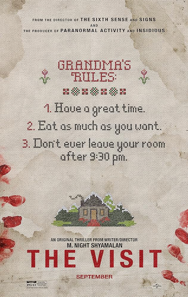
- THE VISIT: The first poster is what creates the most mystery as no figures are involved only a shadow of a couple facing a house with a single window which gives of a very trapped vibes. The shadow of the tree with no leaves relates to Halloween which gives away the genre.
- The second poster shows could be targeted at the older audience (not teenagers) as it shows a letter which creates the action code. the lighting is very dim and more on the grey side which conveys the horror.
- The third poster gives of a holiday vibes until u see the bloody fingerprints which immediately shows the horror genre

- the second poster is more graphic compare to the first one.
- the first poster has very low key lighting.
- both of the posters involve a baby, doll in the second one and a pregnant in the first one
The Blair Witch Project
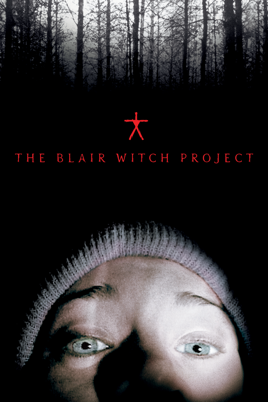
- low key lighting
- one side of the face is lit
- trees in the background- effect of isolation
- only title added on the poster
- bright colour used for the title to make it stand out
The Nun

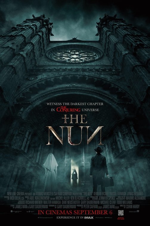
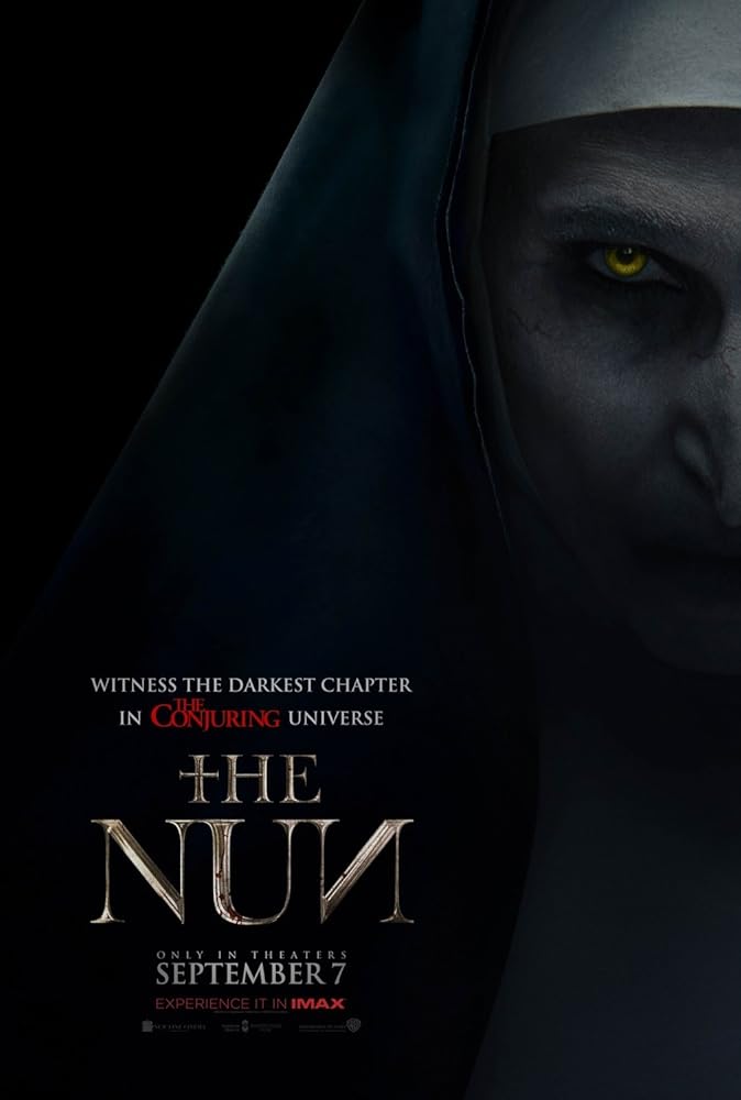
- first poster involves a women and the nun, good or bad, this may be targeted at the females and they may relate to the "good" character.
- second poster low medium angle of the church the main location of the film, can be targeted to the male or female audiences, the smoke added in the poster shows the conventions as well as the blue hue.
- the last poster can be directed towards the fans of the genre due to the protagonists makeup and the theme colour which is very dark.
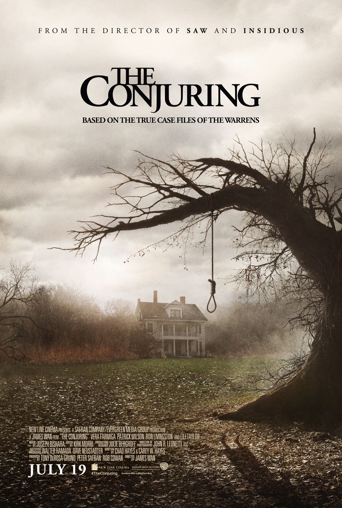


- the first poster involves no characters but only a tree with a rope this could target the fans of the genre. The background shows a house which is their main location, the fog and lack of bright light fulfils the convention of the genre
- the second poster shows a women sitting a doll the background shows a dirty old wall, this poster will target the female audience
1) What conventions are the same on each poster for the same film (i.e. the film's consistent branding)?
- low key lighting
- the font is very similar
- the protagonists face is featured in the poster
- trees are also featured to show an eerie effect
2) What differences can your find between the alternative posters for the same film?
- some feature graphic content and some don't
- they both have low key lightning however some are brighter than others
- different font
- different taglines are used
3) What target audience do you think each poster is targeting and why? How can you tell?
first poster: targeted at the younger audience and older, low key lighting features a couple
second poster: features younger audience features cookies which may appealing too them
third poster: targets the fans of the genre, bloody fingerprints lack of images
4) What can you use from these posters in your own film poster planning and production?
second poster: features younger audience features cookies which may appealing too them
third poster: targets the fans of the genre, bloody fingerprints lack of images
4) What can you use from these posters in your own film poster planning and production?
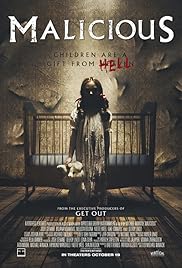
I will be using the low key lighting and the medium angle shot similar to the first poster of the film malicious. i will also be using similar font for my poster as well as how the tag lines are placed.
Planning and sketching
Planning and sketching
1) Create a spider diagram or bullet point list of everything you plan to include in your film posters AND all the ways you could target the three target audience segments outlined in the brief: fans of the genre, males, females. Make sure you also create a local film festival in order to meet this aspect of the brief.
first poster- fan based:
extreme close up of the book opened and laying on the ground/wooden table.
- Title
- Hashtag
- Release date
- Credit block
- Age range
second poster- male:
close up of the main protagonist with his mouth covered with a bloody hand.
- Title
- Hashtag
- Release date
third poster- male and female:
male and female protagonists standing face to face with book in between.
- Title
- Hashtag
- Release date
- Credit block
- Age range
2) Produce an A4 sketch for your first film poster, adding significant detail in terms of text and planned images (you don't need to draw the image if you don't want to - but must offer a detailed text-based description if not). Clearly label which segment of the target audience you are aiming for with this poster and where the poster will be displayed (outside location, magazine or newspaper etc.) Remember that each poster can either be landscape or portrait and also needs to link to the local film festival that will be screening the film (see details in brief above). When you have sketched the poster, scan or photograph it and add it to your blogpost.
3) Produce an A4 sketch for your second film poster, clearly identifying the segment of the target audience this poster will be aiming at. Pay particular attention to details you will either keep consistent (to create a brand identity and cover the local film festival aspect) or change (to alter the target audience). When you have sketched the poster, scan or photograph it and add it to your blogpost.
https://drive.google.com/drive/my-drive
4) Produce an A4 sketch for your third film poster, clearly identifying the segment of the target audience this poster will be aiming at. Pay particular attention to details you will either keep consistent (to create a brand identity and cover the local film festival aspect) or change (to alter the target audience). When you have sketched the poster, scan or photograph it and add it to your blogpost.
1) Which of your characters will appear on each poster? If the characters will be the same on each poster, how will you differentiate the images?
- characters involved in two of the posters
- first poster features the main prop
- all posters will have low key lighting
- alternate poster- all characters involved in the trailer placed around a table-high angle shot-brightly lit.
2) What images do you need for each film poster? Write a detailed description.
3) Write a shot list for the photo shoot(s). Make sure you plan a variety of camera shots you will look to capture (medium shots, close-ups etc.) to give yourself flexibility when designing the posters in Photoshop later. Will the photo shoot be out on location or in school with the white backdrop and lighting?
1st poster:
- high angle close up.
- close up shot
- wide angle shot
2nd poster:
- close up shot
- medium shot
- long shot
- low angle close up
3rd poster:
- long shot
- close up shot/ low angle
- medium shot
- extreme close up of just the two faces of the characters.
4) What costume, props or make-up will you require for the photo shoot(s)?
In the second poster the character will be wearing a dark/dull coloured t-shirt, to follow the conventions of a horror poster and follow low key lightening. I will do their make up to make their skin look dull and and tired.
Alternate poster idea- all characters involved in the trailer will be seated around a table with the book placed in the centre. Only the heads of the characters will be seen, therefore camera isn't required
Comments
Post a Comment